
In the Flow: Introducing the new Dynatrace custom typeface
Unlocking the soul of user experience through type design
As a communication designer on the UX Design Language Team at Dynatrace, I’m excited to announce that our new custom typeface, DT Flow, will be released with our new Dynatrace Platform. The design of DT Flow is our commitment to excellence and user-centered design, and we’re confident that it will significantly impact our platform’s overall look and feel.

At Dynatrace, we understand the importance of typefaces in shaping the user experience of software products. As we gear up for the release of our new platform, we have not only focused on the design details but also taken the time to assess whether our current typeface meets the needs of our diverse user base, which includes developers, operations teams, and business stakeholders. It was clear that to create a truly effective platform with a smooth user experience, we needed a typeface that met our users' unique needs and preferences.
And as the designer of DT Flow, I would like to share the behind-the-scenes of its creation. Why do we need a new typeface? What thoughts went into its design? And what makes DT Flow so special?
Keep reading to learn more about DT Flow.
Why a new custom typeface?
Design plays a crucial role in conveying the character and personality of a company and its products. Every design decision in a product is thoughtfully made to strike a balance between user-friendliness and storytelling: from the color scheme to how data is visualized. The typeface is an essential component of this design and the emotional experience the product conveys and delivers, especially for data-heavy products like Dynatrace.
Creating a custom typeface internally and iteratively allows us to optimize the user experience. This enables us to continually refine the typeface and user interface as we go, making adjustments and adding unique features and custom design details tailored to our needs.
In addition, creating a custom typeface also allows us to express our Dynatrace Platform personality: confident, approachable, and empowering. That’s something an external typeface wouldn’t necessarily fulfill.
Requirements and goals
Before designing something new, we conducted a thorough feasibility study and established clear goals and requirements. This helped us determine the desired style for our typeface, set boundaries for our creativity, and identify essential features that the typeface must have.
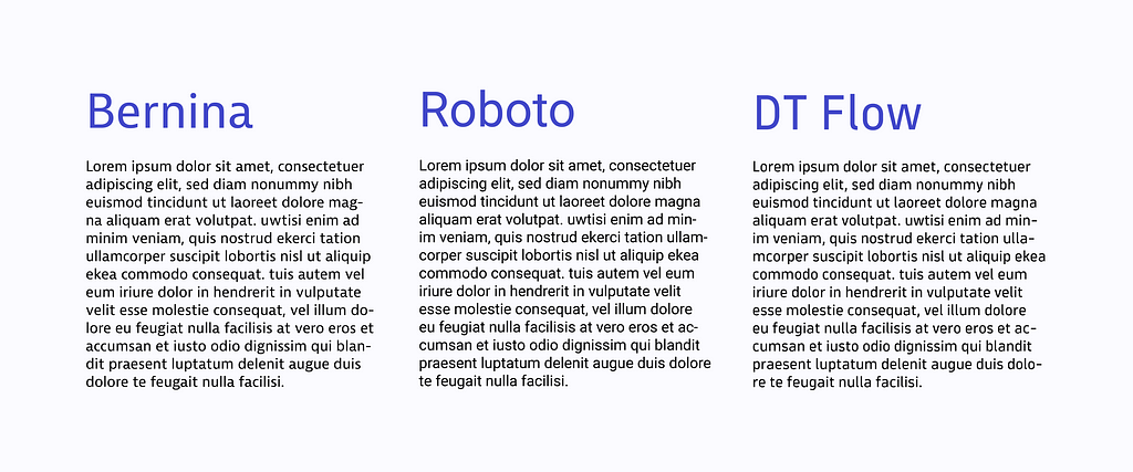
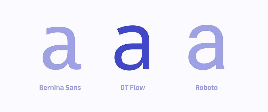
Much input came from the experience that customers and Dynatracers had with the two other typefaces that we used at Dynatrace previously:
- Bernina for Dynatrace SaaS and Managed
- Roboto for the new Dynatrace Platform as a placeholder during the design phase
These two typefaces had their purposes, but they weren’t ideal for the user experience we were trying to achieve with our product.
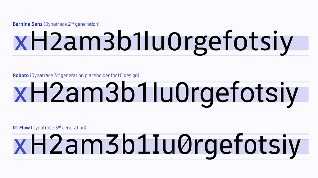
Bernina’s design, for example:
- Is too humanistic for a data-heavy environment like Dynatrace.
- Caused readability issues due to uppercase, lowercase, and numbers all being at different heights
- Had proportional numbers as a default instead of tabular ones, causing more readability issues in data visualizations and tables.
Roboto, instead:
- Wasn’t created explicitly for data-heavy environments.
- When displayed in random order, it wasn’t easy to differentiate certain characters and numbers like 1, l, and I or o, O, and 0.
- Isn’t very unique as it’s already seen in many apps and websites nowadays.
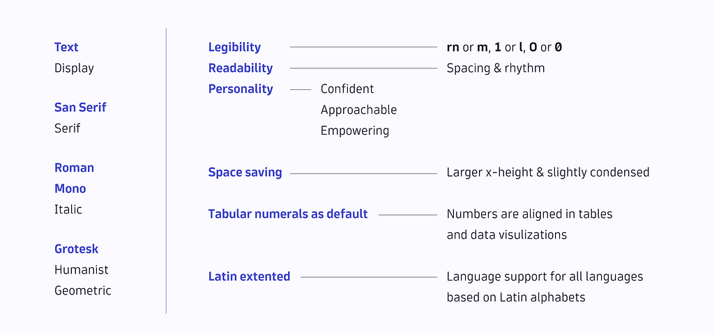
Analyzing why Bernina and Roboto didn’t meet our needs helped us make a list of the requirements for DT Flow, which needed to be:
- Space-saving — to accommodate the display of a large amount of data in a single view
- Conveying the Dynatrace Platform personality — to find a bliss point between humanistic and technical
- Highly readable and legible — since the content displayed in the product can be compact and complex
- Using tabular numbers as default — the numbers need to align to make the user interface look clean
- Multilingual — support as many languages as possible within the Latin script
Design Process
The design process proceeded in multiple stages:
- A feasibility study
- First design in Glyphs
- Test in product page mockups
- Send out to designers for internal testing
- Gather feedback from designers
- Iterative improvement
- Internal demo deployment
- Gather more feedback from both designers and developers based on the typeface’s performance in the demo
- More improvements and version updates
The feasibility study started in July 2021 and aimed to investigate and understand how we could develop the typeface in-house: How much time and resources would we need to invest? What are the major challenges?
Dynatrace is an Agile company, so it also made sense to incorporate an iterative process in this project. For every design iteration, we gathered feedback and made design improvements and adjustments accordingly.
The image below shows the difference between version 1.001 (left) and version 1.012 (right) and how it developed over ten different versions over time.

As you can see, the first version had more decorative elements and roundness. But now, it’s much more simplified, and straight spines were added to the curves to represent the technical product while maintaining approachability.
Design Details
To ensure alignment and consistency within the Dynatrace platform, our UX team has developed a Dynatrace Platform personality that should guide every design and content decision within the product. The personality has the following traits:
1. Confident
We’re confident but not arrogant. We believe in asserting ourselves. Our expertise, experience, and constant innovation keep us ahead of the pack.
2. Approachable
We’re approachable. We believe in being open-minded, considerate, and ready to help. Even though our platform is powerful, it’s not complicated. Even though we’re professional, we’re not corporate.
3. Empowering
We empower our users. We believe in the power of collaboration and autonomy.
The image below shows examples of how we incorporated these characteristics into the design details.
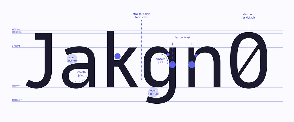
Open aperture = confidence
Open apertures show that we’re open and confident. And in addition, they improve the legibility of letters with those structures.
Smooth joints = approachability
The roundness in smooth joints makes DT Flow look warm and approachable, adding precision and sharpness to the design.
Straight structures = empowerment
Straight spines in curved structures not only show strength and empowerment but also serve the purpose of making the whole typeface more compact and space-saving while maintaining readability.
Higher contrast = a humanistic touch with improved legibility
Although we define DT Flow as a grotesque sans-serif typeface, we still wanted a humanistic touch so that the transition from Bernina wouldn’t be too hard to digest for our users. On the other hand, it wouldn’t look too different from Roboto size- and weight-wise if we need to fall back on it.
In addition, the contrast between thick and thin structures makes glyphs more legible and thus improves overall readability.
Key Features of DT Flow
In addition to the design details mentioned above that convey our product personality, there are still more other features of DT Flow that make it perfect for supporting our specific use case functionality-wise:
- Space saving
- Tabular numbers as default
- Developer-friendly ligatures
- Stylistic alternatives
- Keyboard symbol glyphs
- Optimized for Text usage
- Supports 96 languages
- 10 weights
- Variable Font
Space saving
DT Flow was designed to be space-saving to allow a large amount of data to be displayed in a small space while maintaining readability. Thus, its x-height was slightly increased, and its width slightly condensed.
The weight and width of DT Flow Regular also took inspiration from Roboto Regular, as it’s easier for our designers to translate the components in our design system from Roboto to DT Flow. For example, the size of a button or UI elements won’t change abruptly when the typeface changes.
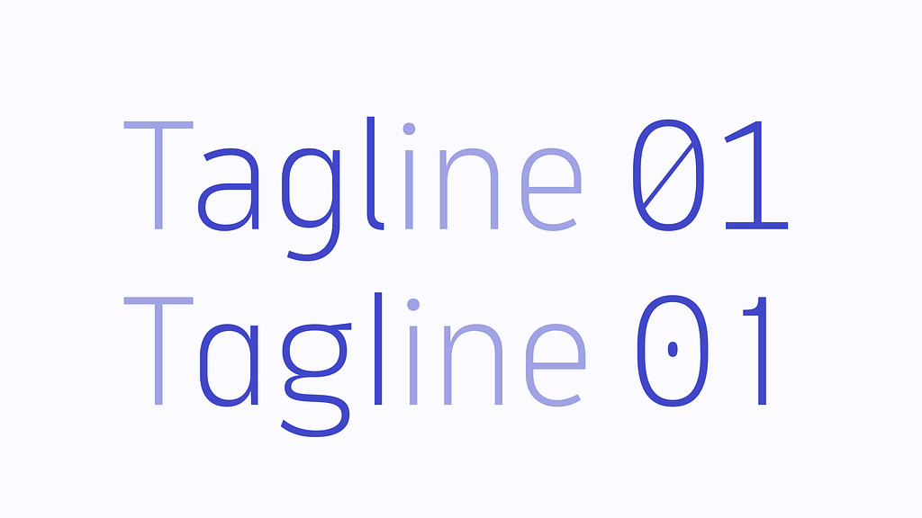
Tabular numbers as a default
The Dynatrace platform displays many numbers in tables, charts, and data visualizations. Tabular numeral figures as a default make the interface look cleaner, more precise, and more aligned.
Of course, other numeral sets, such as proportional lining figures, old-style figures, small figures, and fractions, are also available in the OpenType features.
Developer-friendly ligatures
DT Flow doesn’t include traditional ligatures like fi, fl, or st because they can make the typeface look too humanistic. The design of f doesn’t conflict with the following i or l, and they’re displayed as separate letters.
Nevertheless, we have added a ligature that turns -> into →, based on users’ feedback and requests. We may add more of those ligatures in the future. However, it’s crucial to maintain a proper balance, as having too many ligatures can be misleading for the type of content displayed in Dynatrace.
Keyboard symbol glyphs
Dynatrace always aims to make its user experience smoother, and many users like to use keyboard shortcuts to trigger functionalities within the platform. In addition, Dynatrace displays a list of those shortcuts to help users learn how to use them.
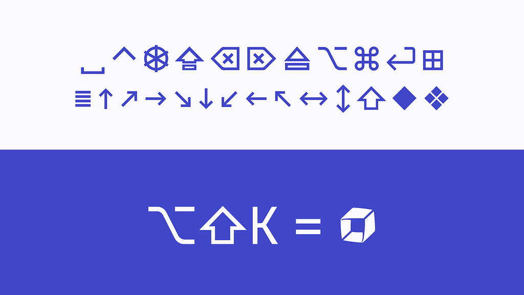
Most keyboard symbols to trigger shortcuts are included in DT Flow’s design as glyphs, allowing the symbols to change in weight if required.
Stylistic alternatives
Although DT Flow is designed to be used in the product, we also want to see it elsewhere. For example, a lovely postcard or a fancy presentation. That’s why we created some stylistic sets for different use cases.
Optimized for text usage
DT Flow is designed as a text typeface for now. It was meant to be used on a smaller scale and paragraphs, tables, or data visualizations for better readability — this suits our needs to use it in the product. Many design details prioritize better legibility and visual balance when the glyphs are scaled down to smaller sizes. When the time is right, a display version may be added to the DT Flow family.
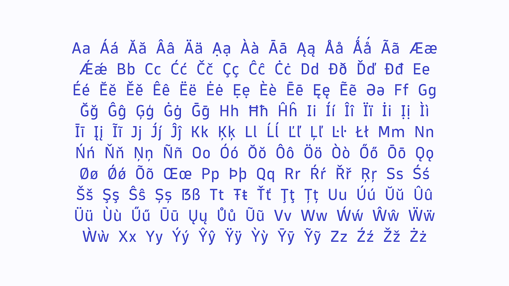
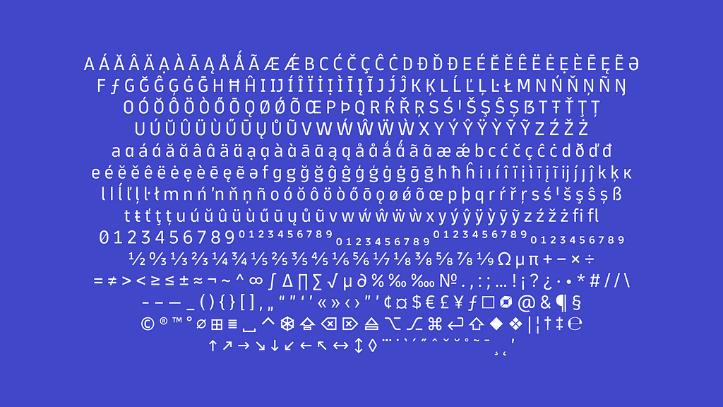
Supports 96 languages
With a total of 795 glyphs, at the moment, DT Flow supports 96 languages, which covers most of the languages in the world that are based on Latin Scripts.
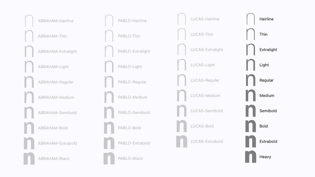
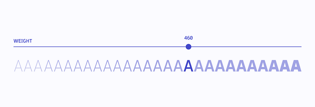
10 Weights
The final design is based on three masters (hairline, regular, heavy). Other weights (thin, extra-light, light, medium, semibold, bold, extra-bold) are generated as instances. Each of the ten weights can be called out with a hundred CSS weight classes (from 1 to 1000).
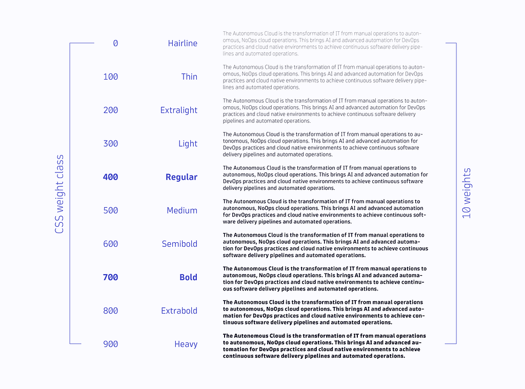
How fast should the weight increase from Hairline to Heavy? We also tested several distribution principles: Liner, Abraham, Pablo, and Lucas (read more here). As a result, we found something between Abraham and Pablo, focusing on Light, Regular, Medium, and Bold — as those are the weights that appear the most in our existing product design.
Variable Font
DT Flow is also available as a variable font based on the weight axis. Instead of choosing from a defined weight among the ten listed above, users can also get the typeface in any weight according to their specific needs and preferences.
Why is it called “DT Flow”?
By now, you may be asking yourself: where does the name DT Flow come from?
Initially, the Dynatrace typeface was named “DT Sans,” as it is a sans-serif typeface. However, we soon realized that this name was not sustainable as it could lead to confusion if different typefaces were needed in the future.
To develop a suitable name, we sought ideas from colleagues at Dynatrace through UX Guild meetings and a follow-up brainstorming session with content designers. Our goal was to stay within the liquid theme that aligns with the current design language of our product.
Other names considered were Orca, Metria, Splash, and Stream, but “Flow” was the most popular and our favorite choice. The name “Flow” represents the idea of data, water, and energy flow and the concept of being in a flow state. DT Flow aims to enhance the user experience and help users make the most of the new Dynatrace platform.
Data flows, water flows, and energy flows.
People perform at their best when they’re in a flow state.
What’s next?
Dynatrace employees are currently using DT Flow in development and staging environments. However, with the launch of the new Dynatrace Platform, it will be accessible to all users.
We have plans to expand the DT Flow family with a unique monospaced design for coding environments — DT Flow Mono.
Developing and designing this typeface was an exciting challenge, and it’s great to see its impact on the user experience and interface of Dynatrace.
As with many things, the only thing that doesn’t change in design is changes. We’re expecting more tweaks and version updates to the typeface. But for now, we’re happy with the result, as it meets our established goals and requirements. And we’re proud to see DT Flow being used in the real world and fulfilling its purposes within Dynatrace.
In the Flow: Introducing the new Dynatrace custom typeface was originally published in Dynatrace Engineering on Medium, where people are continuing the conversation by highlighting and responding to this story.