
From ‘you shall not pass’ to ‘the pass is here’ .
From ‘you shall not pass’ to ‘the pass is here’. How we redesigned our error pages.
Error pages should empower the user, not discourage them from using your app.
Creating a better user experience for our customers and for us, the Dynatrace team.
That was our goal when we decided to modernize the Dynatrace error pages.
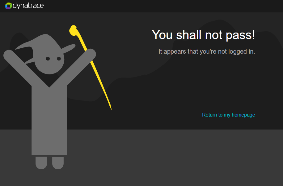
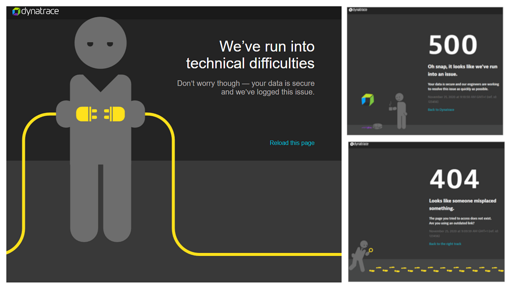
It’s a challenge to work on a feature that is generally liked in the Dynatrace community. Seeing a “You shall not pass” message from a Gandalf-looking Dynatrace character (called Herman) made getting an HTTP 403 Forbidden response a bit easier to bear. And learning that Dynatrace has server issues was a bit less irritating when we could watch how Herman struggled with connecting together two male plugs.
However, we are always striving to improve the experience of using Dynatrace for our customers. And a big part of a brand’s experience is speaking in a consistent tone and voice that permeates through the whole software. Equally important is usability. There were quite a few business and technical improvements in the client error handling to cover — so it was time to implement some improvements.
These improvements aim to significantly change how a user understands the problem that triggered an error page and guide them on what to do next.
So what is it about?
Something went wrong and we cannot service your request - this is the general message of an error page.
For designers and developers, this brings up some questions:
How should you tell the customer? What actions should you provide? How to help the support team handle that? How do you present the error in a manner consistent with the Dynatrace values?
Furthermore, we need to collect situations in which an error may occur. In fact, HTTP has defined Response Status Codes, which are used to explain what happened with a request. However, an HTTP code can have multiple sources of problems. And some errors are triggered on the client-side.
What makes the new better than the old
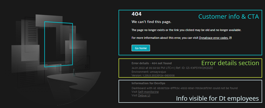
Customer-friendly — employee-friendly. You see an error page and what next? If you are a customer, you want to briefly understand what happened and clearly see what to do. If you are an employee, you want to quickly understand the problem and easily investigate it. But the page cannot be overloaded with information.
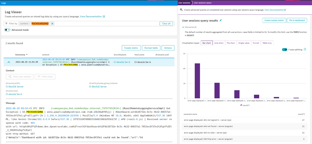
A modern error page is divided into sections. A customer is confident about what to do, an employee knows where to look for details. Each error has its reference ID. Just out of a screenshot, the employee can track the issue.
We drink our own champagne. Dynatrace is a software intelligence platform. We monitor the operations of the application and we can analyze it. Dynatrace monitors the Dynatrace environments too. We improved the error logging mechanism and use Dynatrace to obtain answers.
Call To Actions that meet even sophisticated use cases. After analyzing multiple cases that cause errors, we discussed optimal flows. Getting an error page, you are empowered to take the simplest but effective actions.
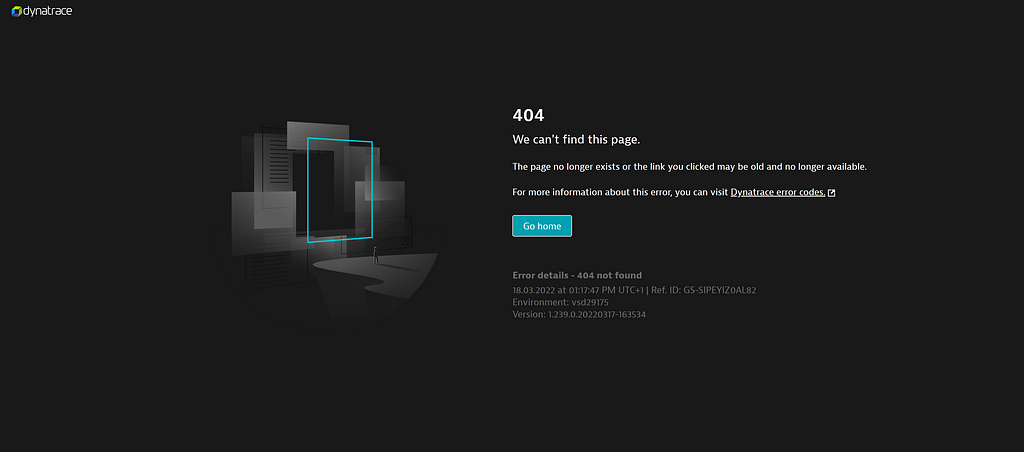
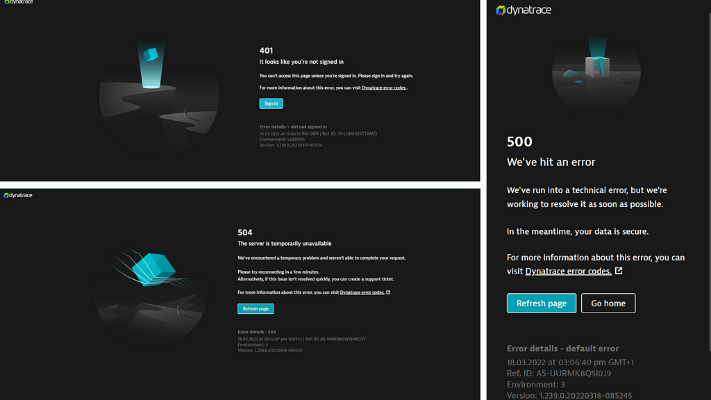
Brand new design. Last but not least, we redesigned the interface. Check it out:
The source of power
I’d always argue, that a supportive team is what makes work effective. An enthusiastic team is what makes work a pleasure. A smart team is what makes work noticeable. I’m happy to say: we have it all 😎
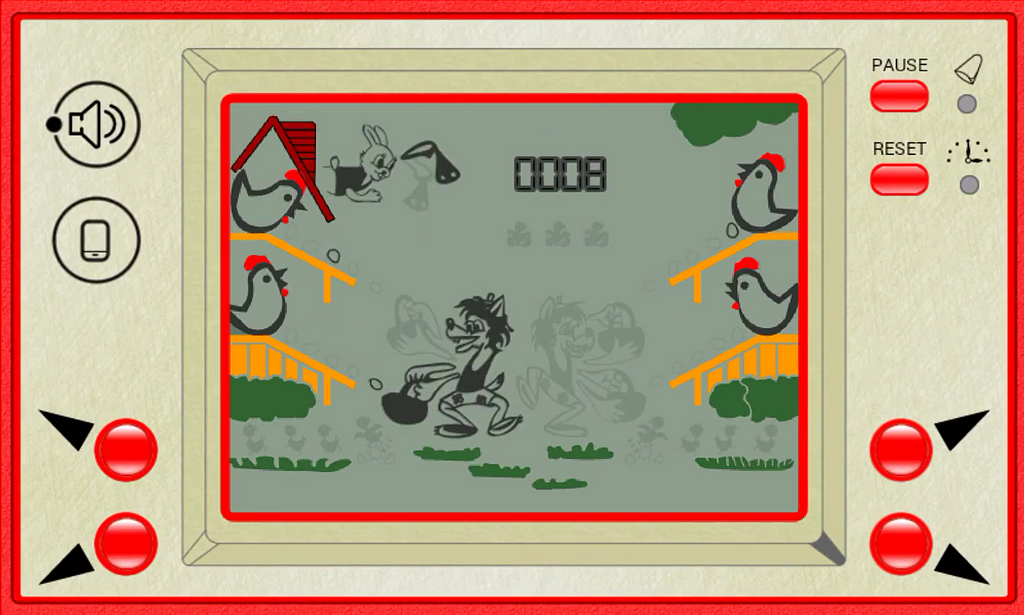
Speaking of which, everything started from an internal team idea. We had multiple concepts on how to make bugs triaging and fixing simpler. Our architect Daniel came up with an endless stream of ideas. I was grabbing them like the wolf from the old-school Wolf & Chicken Coop game.
Momentum
One of the key sayings from my team captain Piotrek is
‘catch the momentum’
And internal error pages improvements were the right thing at the right time.
It perfectly aligned with one of the company goals which is to express our confident, approachable, empowering Dynatrace personality in the product.
We noticed that when the idea to improve the error pages gained the attention of product managers and UX designers. And soon PM Gabi & UX Mik joined us in creating a deep analysis of the error page triggers and call-to-actions. While a group of graphic designers worked on the graphics.
The complication
Do you know the basic parts of a movie plot? Generally, it’s
- 1. Exposition (introducing characters),
- 2. Complication: (the conflict to face, struggle with, and resolve by the end of the movie),
- 3. Climax: (turning point),
- 4. Resolution: (Denouement).
The Dynatrace Modern Error Pages project also had its complication part. I’d call it team capacity. The number of ideas multiplied, but who would implement them all?
We decided to extract the most valuable improvements that can be done in a relatively short time. Believe me, sometimes I was heartbroken when functionality that I regarded as interesting was cut off. Sometimes, I was as brave as a lioness (or maybe stubborn as a donkey), to ensure that a key feature survived in the backlog.
After this spring cleaning, we decided to work two more sprints to deliver value. Afterward, we postponed work for two quarters, to focus on other topics.
A new day has come
After that two quarters, a new spirit emerged in the team. Some guys even focused on the Modern Error Pages tasks during their ‘Friday afternoon’ slots (time slots in our team to polish up tasks of our interest). The results — brand new designed pages with a good tracking mechanism — were instantly visible and that blew wind in our sails.
Should I say we finished it on time? Yep, we did. Also, the whole team got involved in inventing. We were tired, because it was quite a big process, but proud. With a few inside jokes on how engaged I was, we released the Modern Error Pages.
Conclusions
And here I feel I need to emphasize:
it’s crucial to define a goal and designate a route,
it’s crucial to be engaged and it’s crucial to have support,
it’s crucial to be brave and maybe a little stubborn 😏
This mixture made work a pleasure, a challenge, and led to the achievement of the Dynatrace Modern Error Pages. And don’t get me wrong, I don’t wish you errors, but… hope you like them when you meet them.
Acknowledgments 🙌
Behind a great feature, there’s always a great team. A big thank you to everybody who contributed to making our new error pages reality:
Daniel Pieniążek, Gabrielle Hasson-Birkenmayer, Mikele Hasson, Kamil Bakierzyński, Szymon Bultrowicz, John Cheung, Wei-Chun Hu, Piotr Lewandowski, Janusz Lis, Damian Skrodzki, Dorota Zarańska, Denise Yingqiu Dou, Raphaela Raudaschl.
From ‘you shall not pass’ to ‘the pass is here’ . was originally published in Dynatrace Engineering on Medium, where people are continuing the conversation by highlighting and responding to this story.